


For many homeowners, summer is the time to reassess home decor and update their home’s look — out with the old and in with the new! But more often than not, what is envisioned for a space isn’t actually realized, ending in a half-hearted attempt to corral a few dissonant accessories. If you’re a person who finds their deign ambitions leading to design disasters, listen to what the experts from The Wills Co., The Marchetti Co. and Ashley Meier Linens | Interiors have to say. Whether you are planning a total room overhaul or simply want to jazz up an existing space, they show you how to avoid 11 common design mistakes and walk away with an impressive finish.
DESIGN MISTAKE: Over- or under-sized furniture
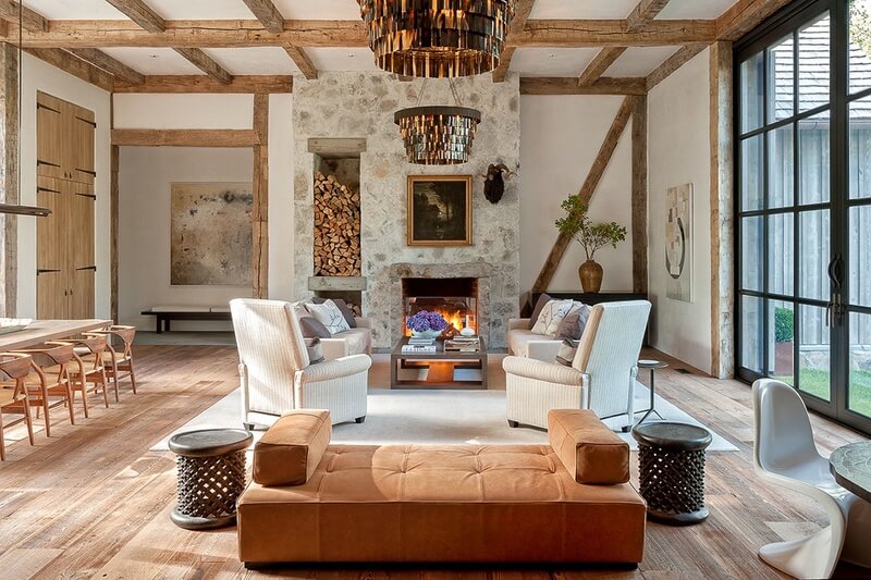
One of the most common mistakes people make when designing a room, is overlooking the size of the space and buying furniture that is either too small or too large. Before you purchase any new pieces, be sure to have exact dimensions of the room on hand so that when you go to look for a sofa or table, you know if it will reasonably work into the flow of the room.
“While oversized furniture can often be and look comfortable, if it is too large for a room, it can cause the room to flow poorly,” says Ridley Wills of The Wills Co. “Circulation and flow are critical for making a home feel and work right.”
DESIGN MISTAKE: Harsh or dim lighting
If you’ve ever spent any time in a department store dressing room, you know that harsh overhead lighting is one of the worst ways to illuminate a space.
“Layering lighting around a room is always a great fix. Investing in a beautiful overhead light makes a lot of sense (especially if you have kids because it is hung high and, therefore, something they can’t break),” says Ashley Meier of Ashley Meier Linens | Interiors. “Sconces and table and floor lamps are then ways to add secondary lighting to a room to make it more visually interesting, as well as more functional. These lights can be turned on as needed, but that way you won’t end up with a room that is too harsh or dim.”
 - 1")
DESIGN MISTAKE: Too many family photos
Everyone loves to showcase their family photos, but since the rise of stainless steel appliances, refrigerator magnets have fallen to the wayside. Instead, people often overload their mantels, shelves, and side tables with pictures of their children and relatives. If you are looking to minimize the chaotic effect of collage-style displays, consider choosing a few of your favorite photos and mounting them in a series of contemporary gold or silver frames. That way, you can create a small gallery of photos of your most cherished memories — on a single wall, in a way that is tasteful and cohesive.
 - 2")
 - 3")
DESIGN MISTAKE: Picking paint before furniture
“Always choose your fabrics and furniture before you pick a wall color. There is a seemingly endless list of paint colors, so it will be much easier to match a paint swatch to your sofa than the other way around,” says Michael Marchetti of The Marchetti Co. “It’s a common mistake that many new homeowners make: They paint a room and then have trouble finding pieces that fit their style and budget to match. The same goes for surface materials like marbles, tiles and woods. Choose those first, then find a paint color that complements the look.”
DESIGN MISTAKE: Hanging on to heirlooms
Thinking about squeezing your grandmother’s chest of drawers into your bedroom? Think again. “Sentimental pieces can actually add interest to your space because they usually tell a story about the people who have them. But if they are outdated or don’t fit the style of your home, there are a few things you can do,” says Ashley. “First, think about whether the piece could be used in another room. Second, think about whether it can be re-purposed in some way (i.e., ‘Can that vintage console you inherited be made into a great coffee table by shortening the legs?’). If neither of these apply, it’s time to move on!”
 - 4")
 - 5")
DESIGN MISTAKE: Undisguised storage
“Beware of open storage — like open shelves and baskets — unless they are enclosed in closet spaces. It is difficult to keep these looking tidy, so it’s best if they are hidden,” says Ridley. “If you are a self-described ‘neat freak’ and you like arranging the all-white dishware, then go for it. This is a look that design magazines constantly tout and show to their readers. However, it is a look that is incredibly hard for most people to keep up with. Glass-fronted refrigerators are a great look but are also hard to keep looking great for this same reason.”
 - 6")
DESIGN MISTAKE: Multipurpose rooms
“Multipurpose rooms are becoming more and more popular as people downsize and move into urban apartments or townhomes where space is limited,” says Michael. “The trick to creating a well-designed multipurpose room — like a home office or workout space — is to make sure that it feels intentional. Having designated areas for things like fitness equipment or office supplies is critical for avoiding a ‘junk room’ effect. Try to minimize clutter in these areas and to use it only for its original purpose.”
 - 7")
DESIGN MISTAKE: Exposed outlets and cords
“I always advise clients to budget for extra outlets, which are relatively inexpensive early on in the design process. It’s a shame to see a beautifully decorated room with a long trail of cords stretching along the base of the walls,” says Michael. “Having a few floor outlets allows you to disguise cords and cables without having to rearrange your furniture accordingly.”
DESIGN MISTAKE: Misplaced window treatments
If your home has a generous amount of windows, consider adding window treatments — like blinds or drapes — to add privacy, as well as texture and color. “Be careful in placing floor registers near curtains that hang to the floor, or in hanging curtains to the floor near floor registers. If the register is too close, then the air circulation will cause the curtains to billow out and not hang right,” says Ridley. “Curtains are too expensive to end up having them not hang like you want them to hang.”
 - 8")
 - 9")
DESIGN MISTAKE: Plain white walls
Stark, white walls can be incredibly effective in a home, but they also can look very sterile if they aren’t decorated carefully. They can also be a potential disaster for families with kids and pets because they show nearly every fingerprint (or paw print, for that matter).
“Know yourself and/or your family,” says Ridley. “White walls are a wonderful background for unique art and decor. However, if you are running Brownie troops throughout your home, just know that there will be gray smudges throughout!”
DESIGN MISTAKE: Misplaced artwork
An easy way to add color and dimension to a room that feels drab is to add artwork. But beware of turning your home into a museum. Hanging art should make your home feel personal and intimate, and the work should complement the furniture and design of a room, not dominate it. “Art can be critical to making or breaking the best designed, architectural plans. Less can often be more,” explains Ridley. “One well-framed work of art on a wall can often look more stunning and expensive than a lot of ‘stuff.’ That being said, a cluttered, floor-to-ceiling display of art can be a joy to behold. However, this seemingly casually created look is difficult, at best, to achieve well. It takes a deft eye to pull this off.”
 - 10")
By avoiding these design mistakes, you will love where you live even more!
**********
To stay in the know on the best of the South, follow us on Instagram!