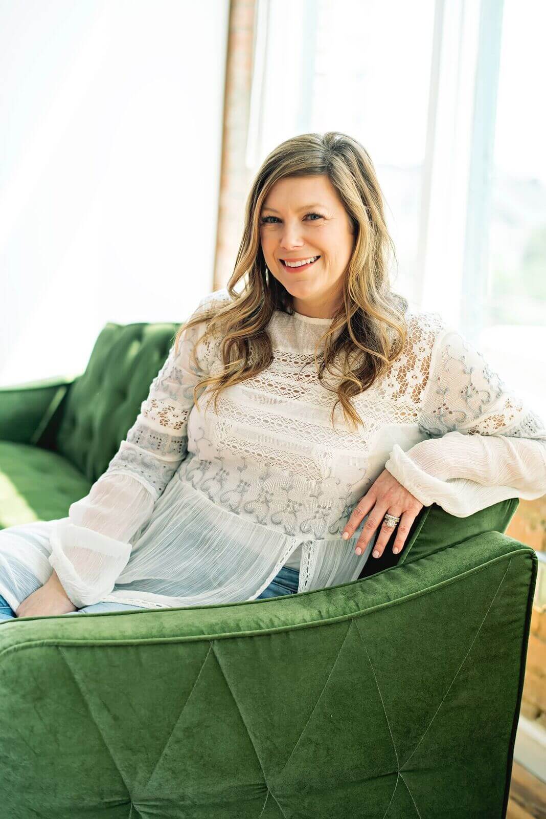
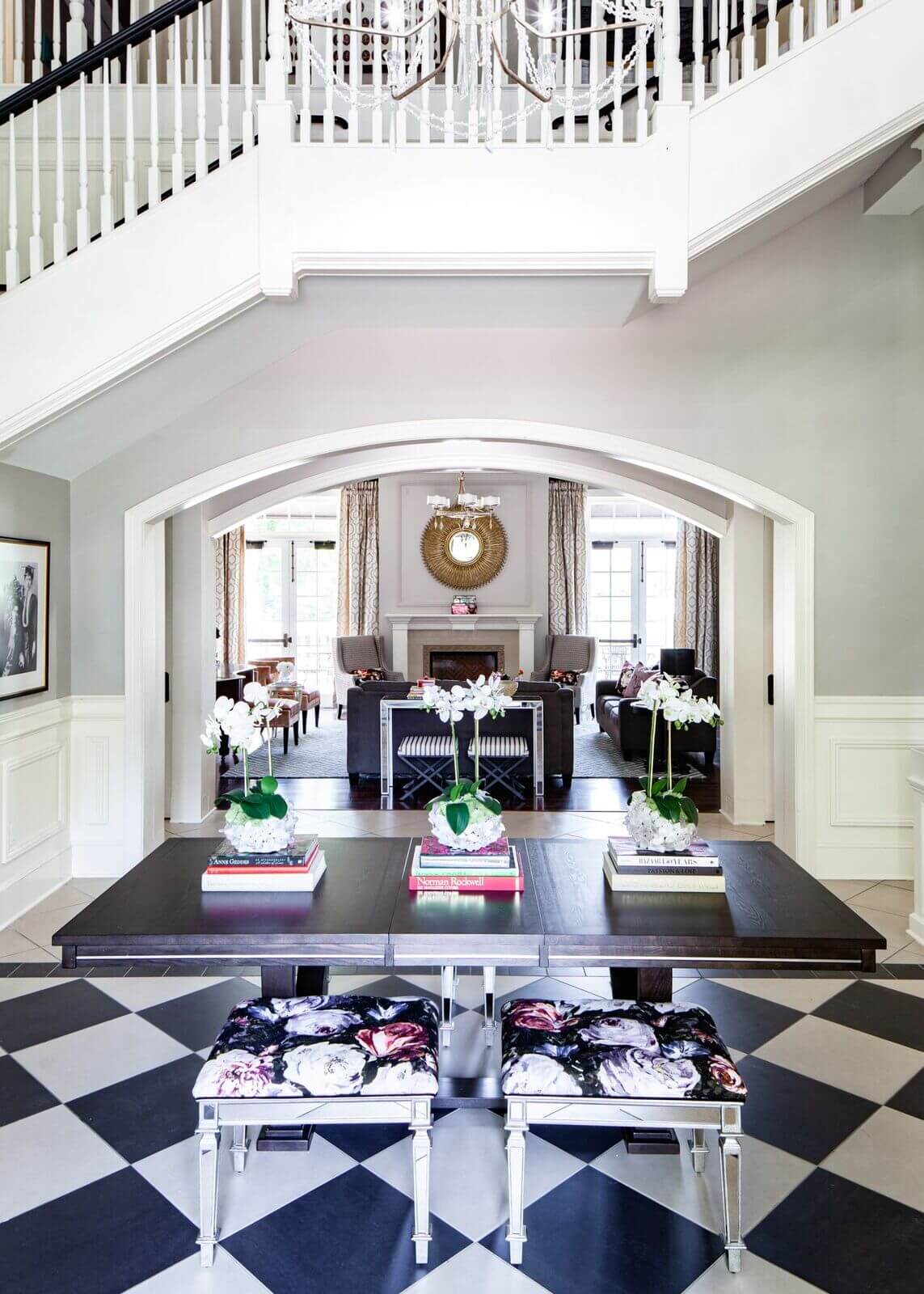
When Abbe Fenimore was a child, her mother asked her how she wanted to decorate her bedroom. “I’m pretty sure I said, ‘Bright and colorful’ … and some things just never change,” says Abbe, the Dallas-based interior designer known for a more-is-more approach to design, with clever layering, bold prints and, yes, terrific colors. Her firm, Studio Ten25 captures that young-and-fresh look for clients young and old, from historic Dallas to Southern sorority houses, capturing it all on her fun-loving Instagram page.
We caught up with Abbe to find out more about her background and inspiration. Meet our newest Interior Designer Crush!

Where did you grow up, and how did it influence your design style?
I grew up in Little Rock, Arkansas and South Louisiana. My parents’ love for travel influenced my design style much more than where I was raised, I think. My father worked in the military, which required him to travel for work a few times a year. Whenever he returned, he would bring trinkets back from the locations he was visiting. My favorites were the pieces from New Mexico, with their beautiful shades of turquoise and coral. In retrospect, I believe this inspired my love for color in my personal life and in my designs.
What’s your educational background — or if you’re self-taught, that’s interesting, too.
I received a Bachelor of Interior Design from Louisiana Tech University in Ruston, LA. I loved my time at Tech and was fortunate to be surrounded with classmates and professors who taught me so many wonderful things about being creative and working in the world of design.


Have you always had a passion for bold colors and patterns? What are some of your favorite combos and colors, and conversely … are there colors you don’t like?
When it comes to incorporating color into design, pink has always been a favorite of mine, as I love its variation of hues. Raspberry is my favorite in the spectrum, hands-down, but blush would be a close second. When working with raspberry, I like mixing rich jewel tones or black and white with it, and incorporating velvets and chic linens into a room to give the overall design an air of sophistication. When it comes to working with blush hues, I pair soft turquoise hues, metallics, and Mongolian fur elements to the design for a glamorously feminine look.
On the flipside, red is my least favorite color to design with, as it can easily take a design hostage. If it isn’t balanced visually with neutrals or subtle textures, it becomes the only thing that your eyes are drawn to. I do incorporate red into my designs, but in smaller doses, like in accent pillows, an accent in a rug, or in art. This keeps the color more classic rather than aggressive.
What’s been your favorite project to date and why?
That’s a tough question! I consider all of my projects special because of the relationships I was able to build through them. But, if I had to choose a favorite, designing my own home takes the cake. My husband and I purchased a 1940s brick house a few years ago, and took it all the way down to the studs. I love the way our home is designed because it’s a reflection of the life we have together.


You’re not afraid to incorporate vivid elements in a room, but how do you make sure something isn’t too much? How do you “ground” a room?
Using the right neutrals in furniture and draperies is extremely important when grounding a space. I love to upholster sofas or ottomans in hues of grey or ivory. These subtle shades allow us to mix in bold patterns on the rug, accent pillows, or through art. But another great neutral shade to ground a room and balance out the space is navy. This color works wonderfully with multiple color palettes. Another trick I like to do: install draperies in a similar color to your walls as a way to soften a room and prevent the drapery from taking over and commanding the space.
What are some of your favorite sources for furniture and accessories…either brick-and-mortar or online sources?
I am fortunate to live in a city like Dallas that’s home to an incredible design center full of unique resources. As for a great retail shop, Blueprint is one of my favorites with their amazing selection of art and accessories. Plus, their vignettes make it easy for customers to create unique looks for their home. When it comes to fabrics, my go-to source is Designers Guild because of the vibrant colors and prints they offer. Bernhardt, Duralee and Lee Industries are a few of my go-to sources for furniture.


Does Dallas have a distinct style? What role — if any — does Texas have in your designs?
I love that design in Dallas has evolved from the “Texas Tango” of the ‘90s to a mix of modern and transitional aesthetics. We currently have Texas modern homes popping up next to oversized traditional homes, and the mix works to create neighborhoods full of personality. The thing about Texas style is you can have a modern ranch style home or a sleek modern home and both will still incorporate local stones, hardwoods and landscape true to our state. I like to incorporate these warmer wood tones and natural elements into my designs to bring to life the rustic feel that Texas exudes.
If you could be the designer for any well-known person, who would it be?
Kacey Musgraves! I am a huge fan of her music, but her sense of style is absolutely perfect, too — full of glitz, glam and cowboy boots. I think she would be a blast to work with and would be open to creating a home that breaks all the rules (my favorite kind!).
Thank you, Abbe! See more of her work, videos, accolades and more at studioten25.com.
**********
Meet more of Interior Designer Crushes in our archives. Click HERE!


