


When Elizabeth Burch, owner and lead designer of Elizabeth Burch Interiors, was approached by a friend-of-a-friend to review the plans for a Sylvan Park renovation, she expected to take a look, perhaps make some tweaks, then give the project her blessing and let them run with it.
Instead, it turned into a year-long collaboration that completely reimagined how the spaces would work for the family. The result was a bright, functional remodel with touches of both traditional and modern interior design. Take a look around!

When Elizabeth was brought in, she saw an opportunity to create a home that worked for a family that prioritizes comfortable, liveable rooms that function for every person in their household. She totally revised the original plans and drew up a set of new plans emphasizing rooms and a design that would flow from space to space. Throughout the process, Nashville-based Phipps Construction worked with Elizabeth and her team to bring the vision to life.
The home is a four-bedroom, four-bath house that spans nearly 3,000 square feet. There was ample space to accommodate the lively family, but the layout wasn’t practical.
The renovation kicked off by demo-ing the existing kitchen and rearranging the downstairs rooms. The former living room was turned into the kitchen, and the front sitting room became the main living area.

Elizabeth completed all the furnishing and styling for the front sitting room, giving the family a blend of classic elements with a light and bright aesthetic. “My design aesthetic is traditional meets modern. I always strive to use some traditional design elements in my designs, such as antiques or vintage pieces,” says Elizabeth.
She looks for an unexpected mix of timeless elements, modern silhouettes, and delightful details, often infusing color and pattern. Greek Villa by Sherwin-Williams was used on the walls, trim, and ceilings throughout the home for a clean, crisp backdrop for elements like the Kelly green club chairs, blush pink drapery, and dreamy painting from Nashville artist Lizzy Love. Small moments, like the candlesticks from Found by Frank, add a curated effect to the space.


The dining room is open to the living room, yet a soft arch gives a slight separation and allows each room to have its own identity. The centerpiece of the dining room is the Visual Comfort Étoile chandelier, which hangs above a modern table and chairs. Vibrant, bold abstract art adds a surprising element to the otherwise subtle space.


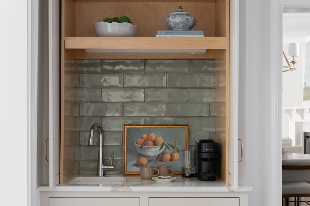
One of the major benefits of the renovation was the addition of a breakfast nook and coffee bar leading into the kitchen, which gives the family another place to gather for meals beyond the formal dining room. This space has a cozier, more intimate look than the rest of the home, thanks to built-in shelving and a banquette painted in Sherwin-Williams Rosemary.
Elizabeth styled the shelves with objects featuring organic, rustic textures and some of the family’s favorite cookbooks. These objects draw on the warmth introduced by the rich wood table, and the black captain’s chairs play into the moodier look. Overhead lighting and sconces give the space a layered glow.

In the kitchen, touches of warmth and color continue in the texture of the tile, the unexpected light green within a cabinet, and the soft touch of the bamboo shades. Elizabeth perfectly executed the white kitchen in a way that feels welcoming and approachable rather than clinical. Benjamin Moore Edgecomb Gray on the inset cabinets is the perfect neutral-but-not-quite-white shade to create the foundation of a comfortable, family-friendly kitchen.
In a world of panel appliances, Elizabeth proves that keeping up with the prevailing trend is not always necessary. This kitchen feels both timeless and fresh, balancing high-end touches with liveability.


Like all good homes designed for busy families, the mudroom was essential. This was carved out within the existing floor plan, and it’s a must-have for corralling all the trappings of life. Benjamin Moore Boothbay Gray was used on the built-ins to bring in a fresh, high-contrast look to offset the white, but it also adds a layer of practicality — this color will stand up to kids and scuff marks. The natural weave baskets add the same level of warmth that is woven throughout the home.


“For the upstairs bathroom design, we ran into a few challenges with the layout. This bathroom was meant to be a kids’ bathroom, but we wanted to make sure all family members could use it if needed,” says Elizabeth. The issue, it turns out, was the ceiling, which sloped where they needed to put the shower-tub combo. The homeowners are tall, so it prompted Elizabeth to think outside the box.
They ended up separating the shower and the tub to make for a space that’s both practical and beautiful.


Looking back on the project, Elizabeth says, “This was a really fun project for us to work on, as we got to transform these rooms into really beautiful, comfortable, and functional spaces. It’s one of my favorite projects to date!”
This article contains product affiliate links. We may receive a commission if you make a purchase after clicking on one of these links.
**********
For more interior design inspiration, check out our other home features!