

Whimsy Meets Cozy in This Dreamy Carolina Blue Home
When their daughter enrolled in UNC, a Virginia family used Georgia & Hunt to turn a Chapel Hill condo into a Carolina blue-inspired family retreat. Image: Heather Ison Photography
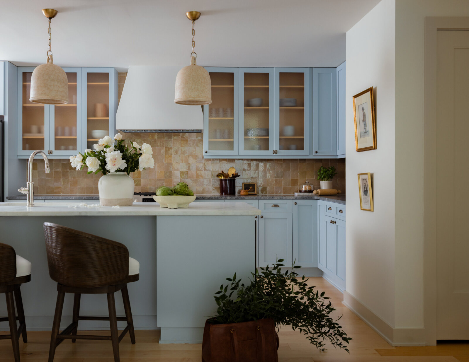
It’s always a testament to a design team’s talent when a client comes back to them for a second time. And it’s even more of a ringing endorsement when that client asks them to work on a project miles from home!
That’s what happened when Virginia-based interior design firm Georgia & Hunt was asked to design a Chapel Hill condo for a McLean, VA, family who wanted to set up a “base” near their daughter at UNC in North Carolina. Founder Kristin Harrison was tasked with turning the modern unit into a retreat that would make the whole family feel right at home.
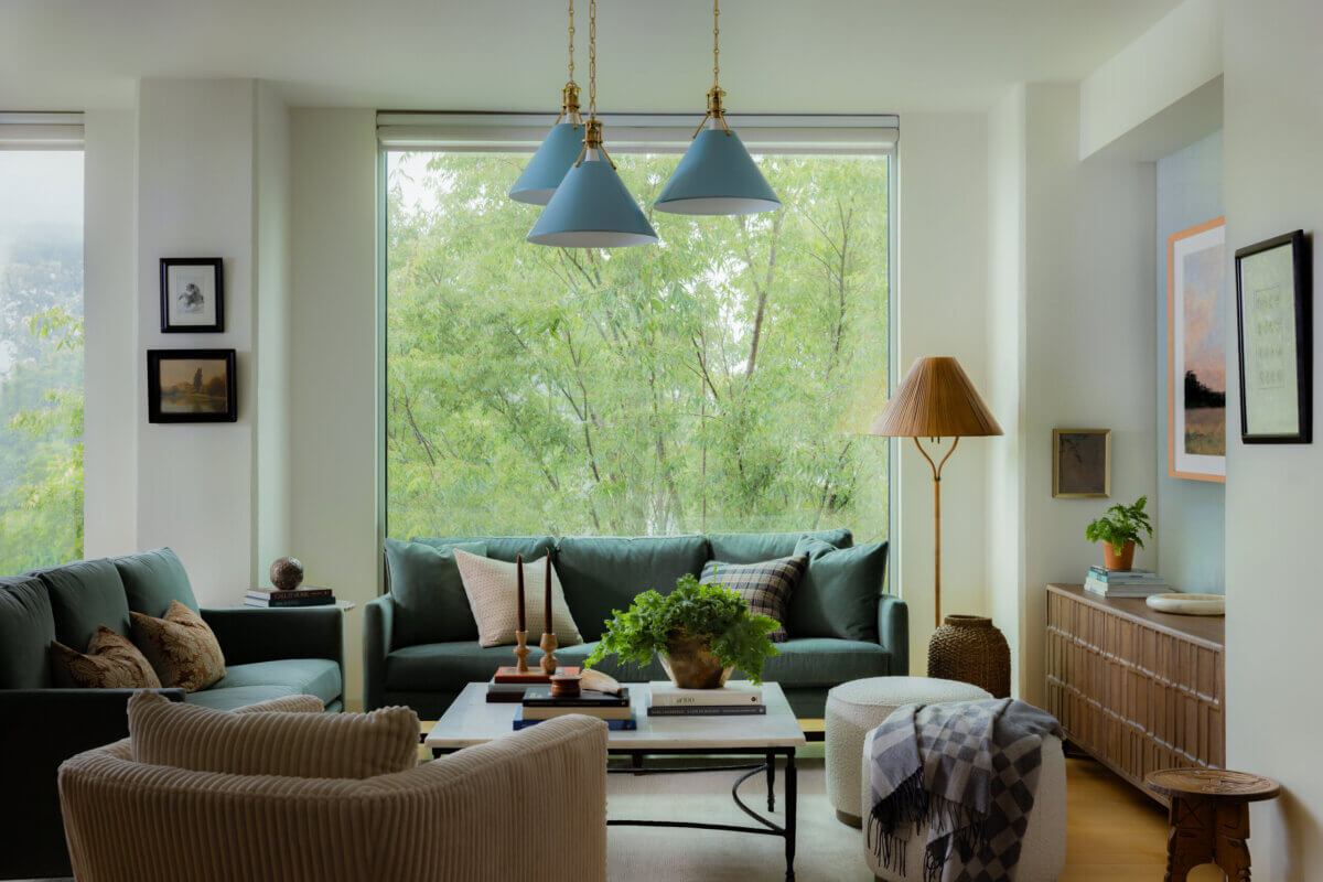
Because of the condo’s smaller size and its location in a vibrant college town, Kristin had the opportunity to take it in a more fun, less formal direction than the family’s primary home in Virginia. “Because I had already worked with them and understood how they lived, there was a level of trust that allowed us to take the Chapel Hill condo in a different direction. They gave me a lot of freedom to make this home lighter, more relaxed, and more playful,” says Kristin.
The plan for the condo was a light renovation with cosmetic changes through paint, wallpaper, lighting, and decor. The starting point was a pretty shade of Carolina blue, a reference to its location right in the heart of Chapel Hill. Kristin wanted to create a look that felt young and youthful, with elements of whimsy throughout.
But there was a careful balance between referencing UNC and becoming overly themed, which Kristin managed by using various interpretations and shades of the color. “We incorporated different variations of blue throughout the home through the cabinetry, lighting, wallpaper, and upholstery,” she tells us.
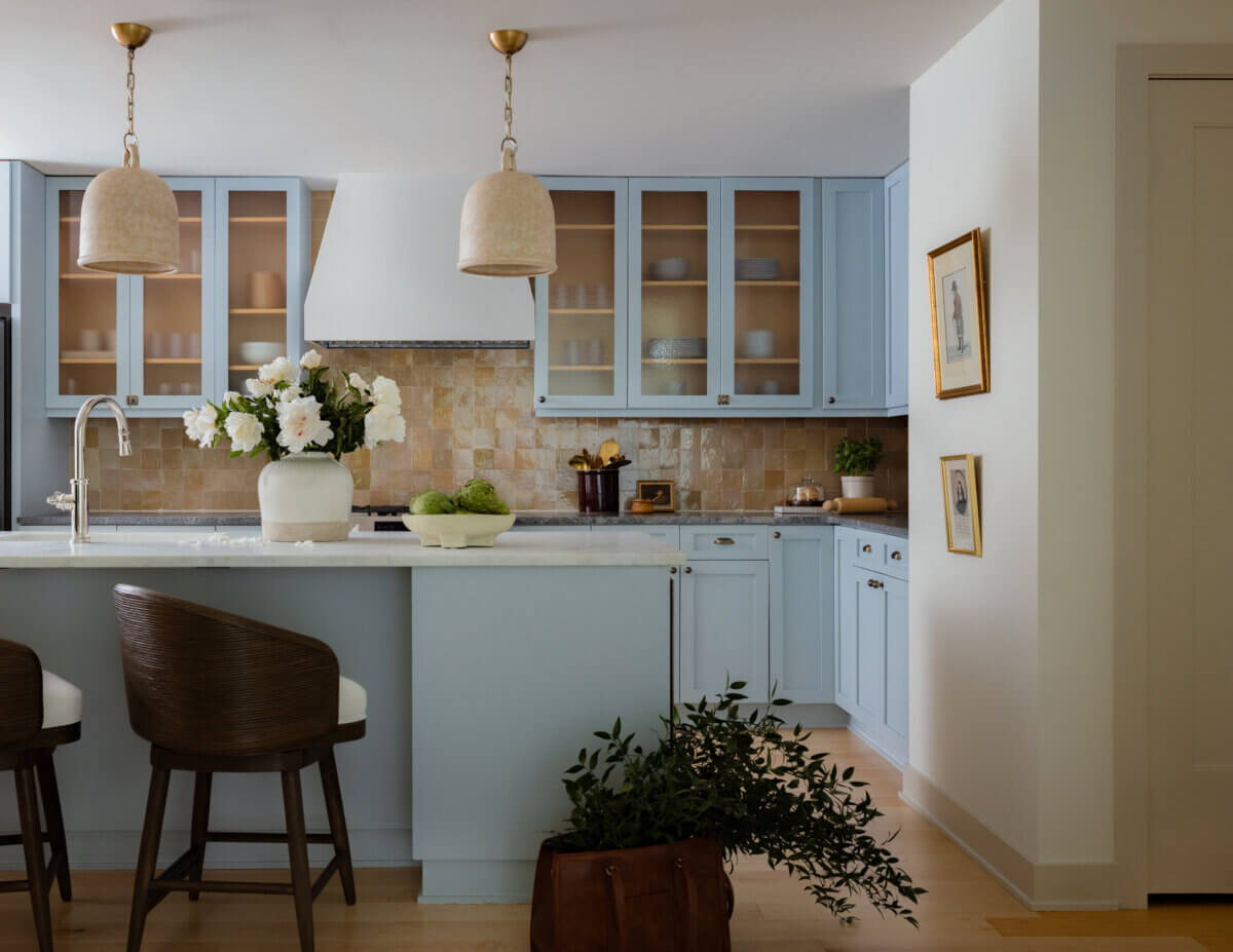
The clients were open to using color boldly, particularly as they sought to create a space that felt distinct from their main residence. That freedom in design led to a playful kitchen in the perfect shade of light blue: Benjamin Moore Smoke. The pretty color is contrasted with a backsplash in a warm terracotta zellige tile, a soft gray soapstone counter, and lighting that adds an element of organic elegance.
Kristin explains, “The blue in the kitchen became one of the strongest expressions of the Carolina blue palette, but we balanced it with the softer stone, wood tones, and neutral upholstery so it still felt sophisticated rather than themed.”
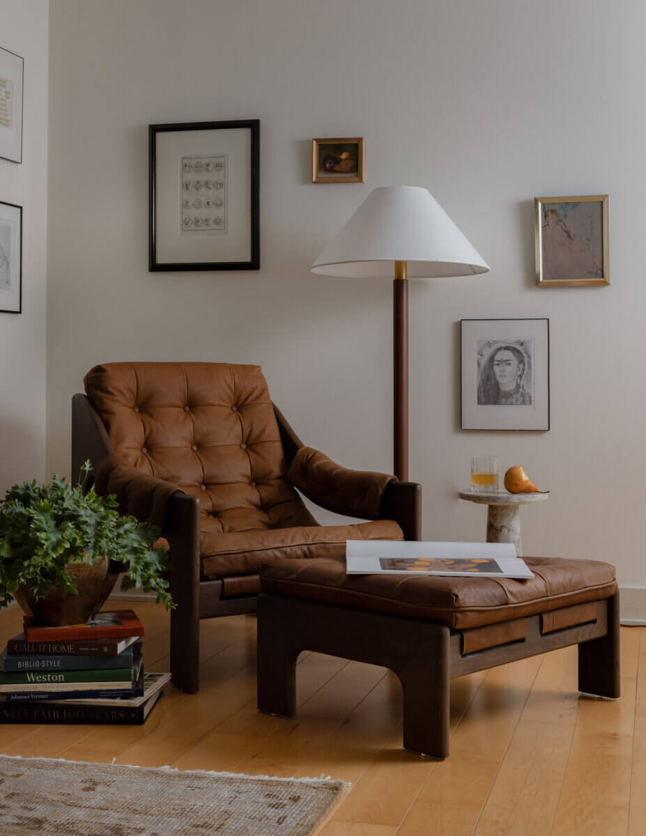
Throughout the home, there are layers of beautiful items, textures, and collections. Each piece adds to a story that makes the space feel like it’s full of life. “I wanted the living room to feel warm and inviting rather than sparse, which can sometimes happen in a second home,” says Kristin, explaining the thought process behind the styled vignettes.
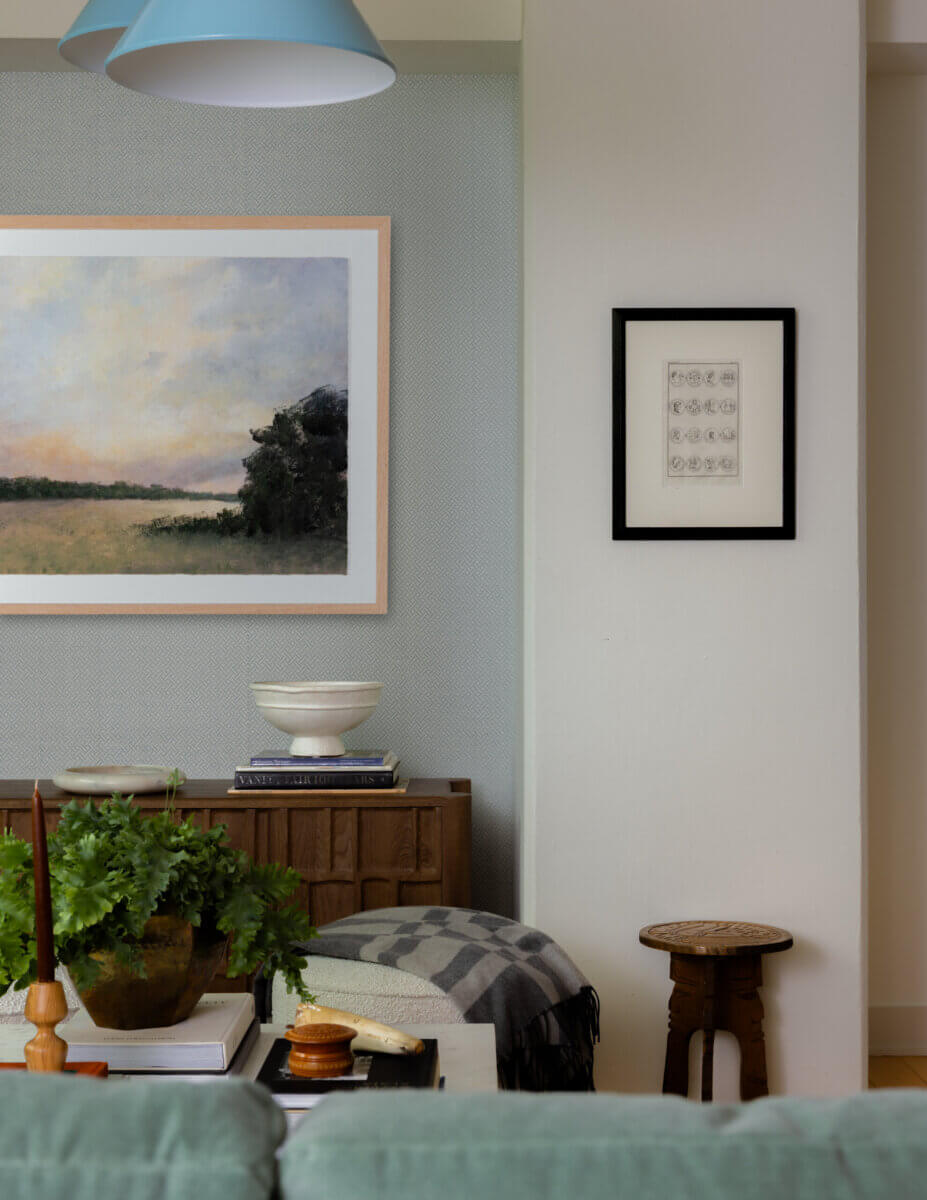
While blue is the throughline, greens and neutrals are featured in the palette, too. Kristin notes, “The large windows and surrounding trees gave us a beautiful connection to the outdoors, so the green helped ground the space alongside the Carolina blues.”
Carefully selected warm wood pieces, patterned pillows, knit textures, and sumptuous upholstery create a space that the parents are eager to visit outside of a few big weekends a year, and a hangout that their daughter is thrilled to have when she wants to escape the hustle and bustle of campus.
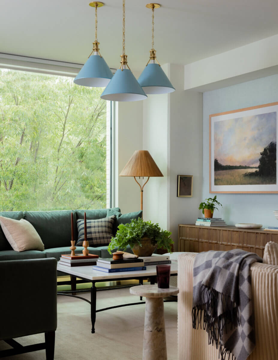
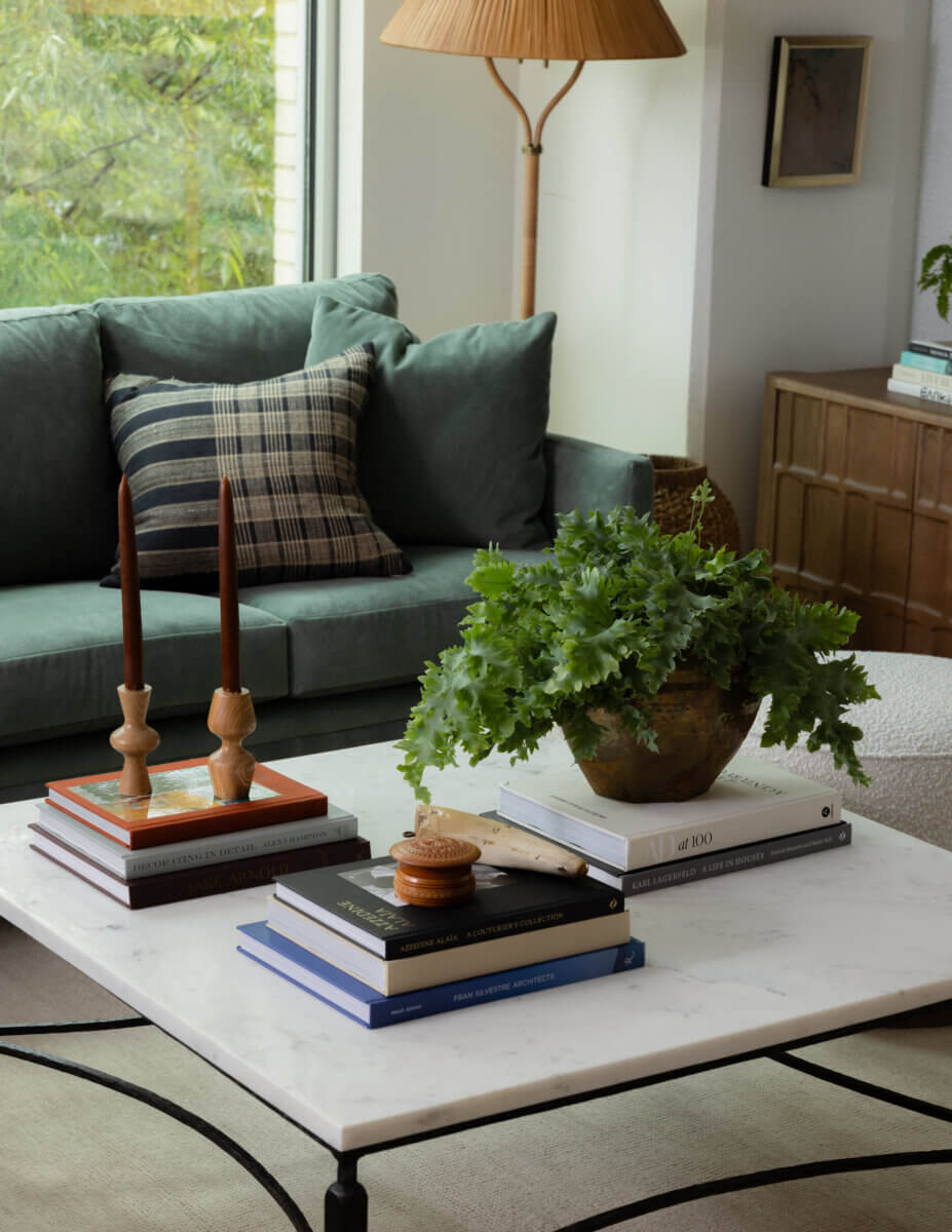
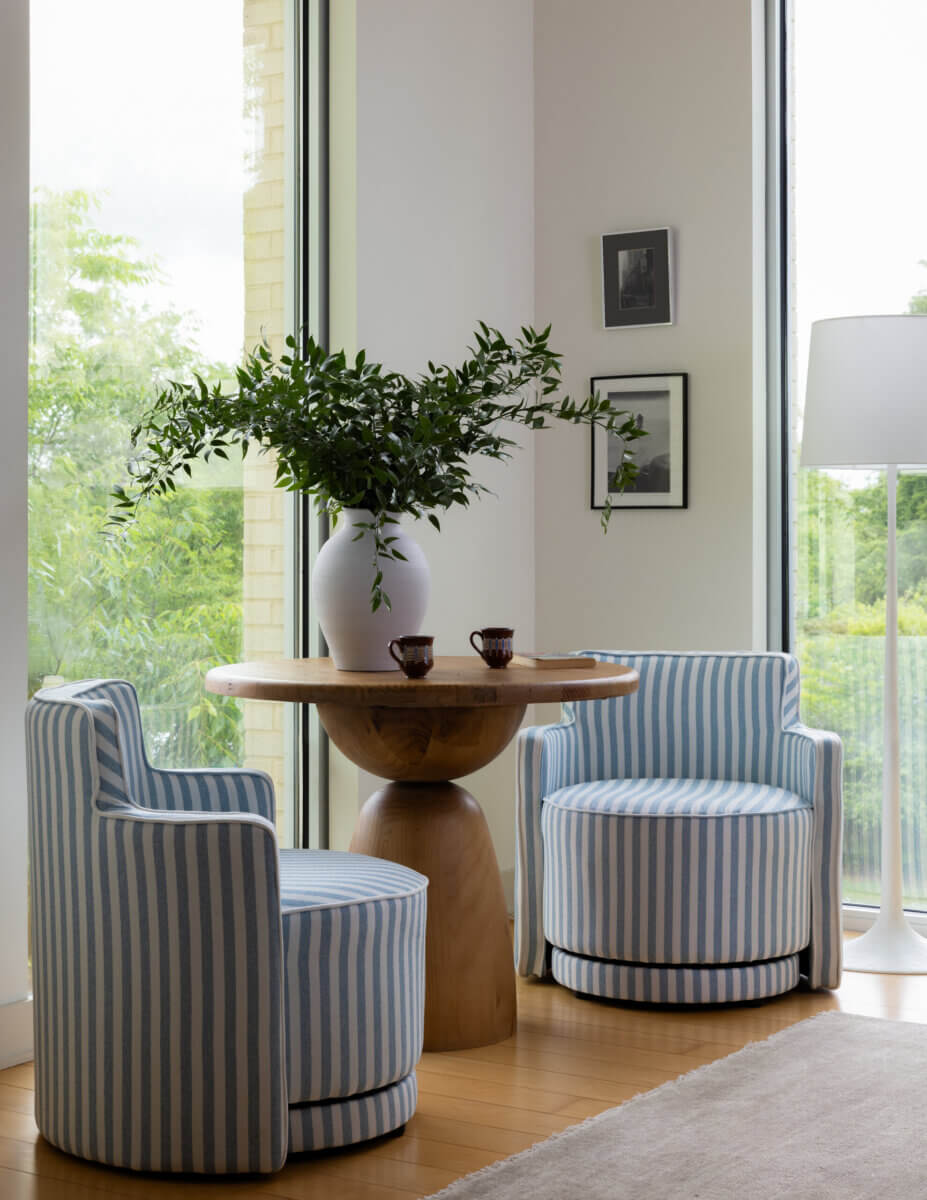
Right next to the main living room is a sitting area that Kristin saw as an opportunity for a separate conversation zone. It’s a cozy spot, and two Carolina blue-striped chairs are the perfect echo of the kitchen’s color scheme and the living room’s pendants. “Since this home needed to cater to both the clients and their daughter, creating areas that cater to different generations and needs was important,” she explains. “As we were only able to fit two chairs into this space, we went more bold with the design.”
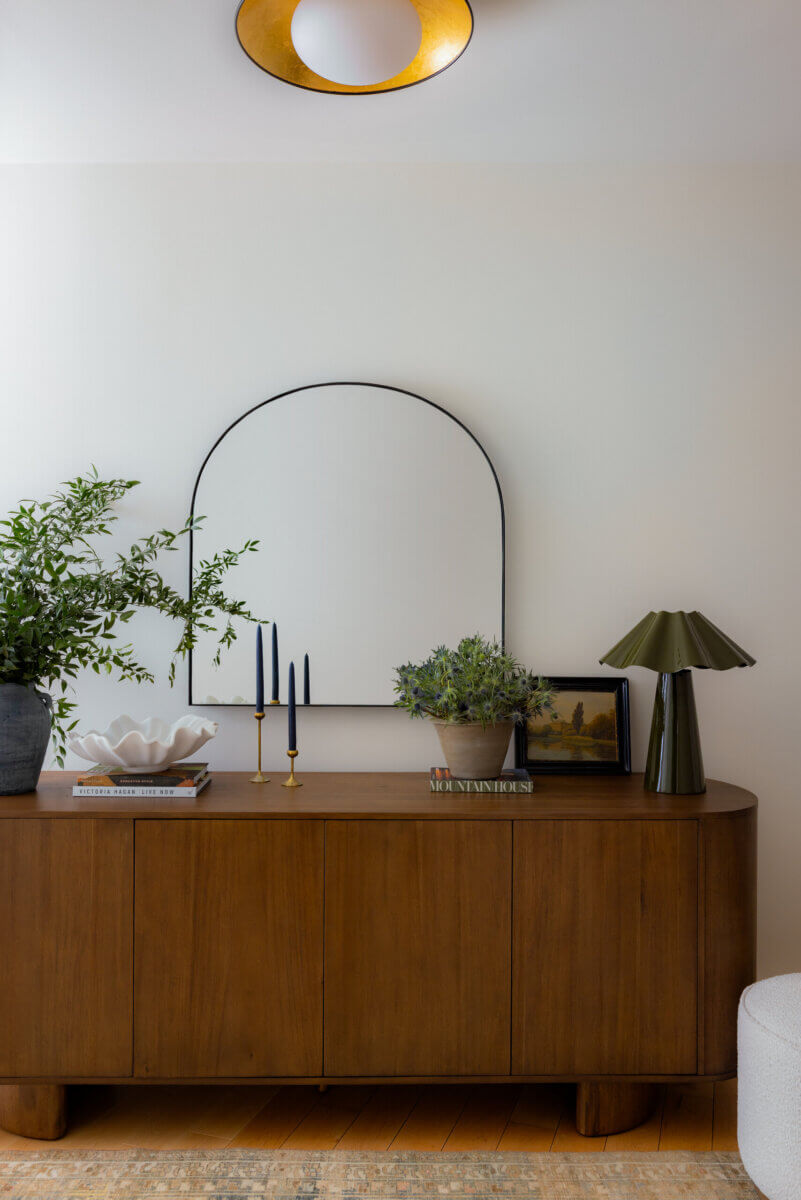
It’s not apparent from the condo now, but it started as a white, open, industrial-inspired space. Now, each area feels distinct, and the dining room is both the visual break and the bridge between the whimsy of the blue kitchen and the coziness of the living area.
“The dining room is slightly more streamlined and neutral, but with the intention that each of these pieces be versatile enough to be reused in future homes and spaces,” says Kristin, who made sure to source items with the future in mind. “This isn’t necessarily a forever second home for the family and, someday, they may want to use these pieces elsewhere.”
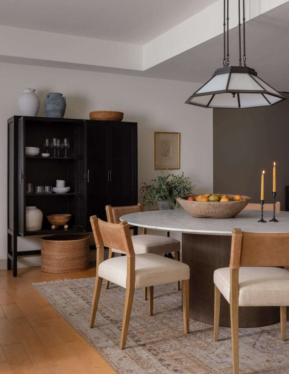
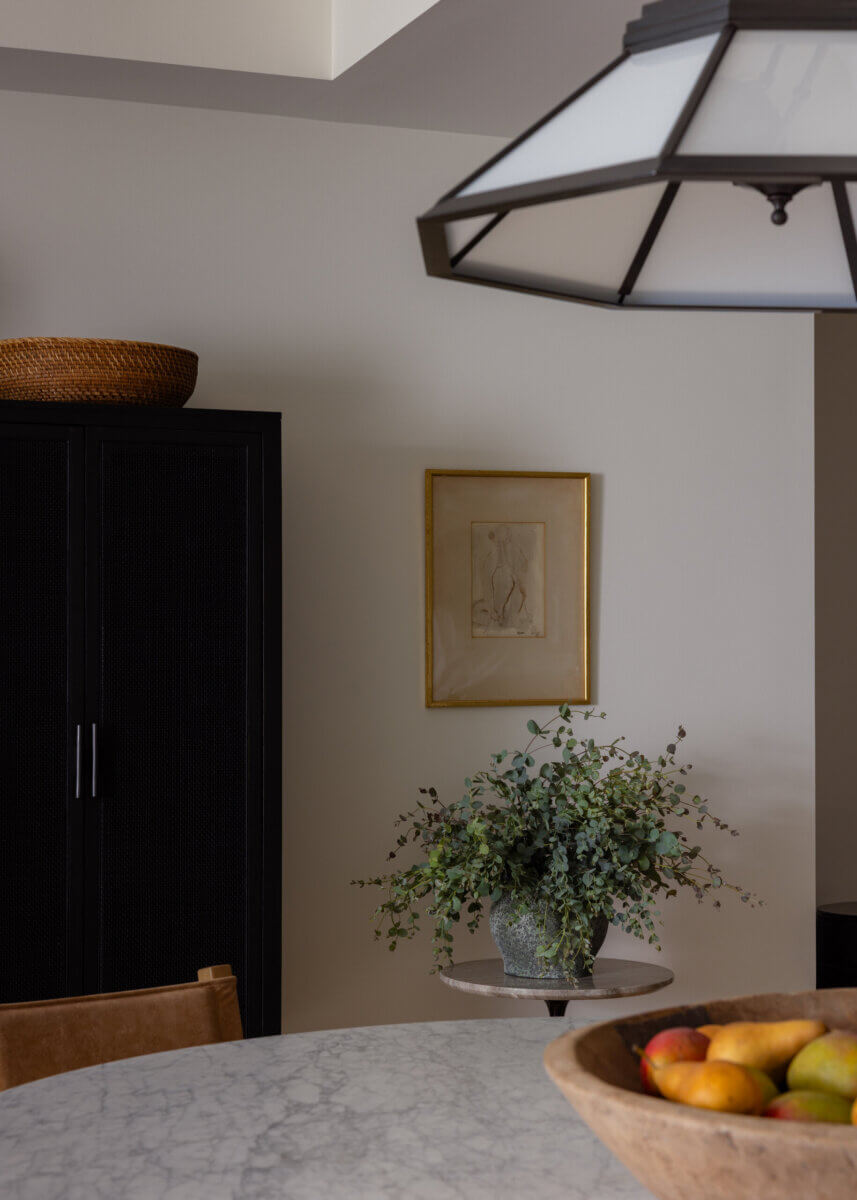
While the condo has the illusion of a space that was collected over time, the opposite is, in fact, true. Design projects often come together over the course of seasons or years, but this one was a sprint from start to finish. “We had roughly two to three months to complete the project, so there wasn’t time for a lot of custom work,” says Kristin. “We had to be strategic about finding readily available pieces and using them in a way that still felt highly considered.”
But, thanks to careful sourcing, each piece looks as if it has a story to tell.
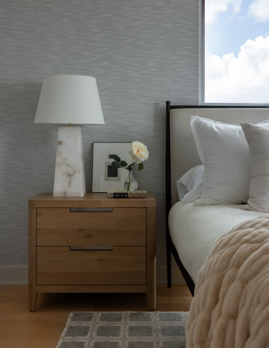
Because this was a light facelift rather than a full renovation, wallpaper was used throughout the home to add movement and texture without investing time and resources in millwork or construction. In the primary bedroom, a light blue wallpaper with just a hint of tactile pattern creates a nature-inspired palette when juxtaposed with the floor-to-ceiling windows and the treeline just beyond them. “Balancing the green with a blue just seemed natural. An extension of the sky beyond,” says Kristin.
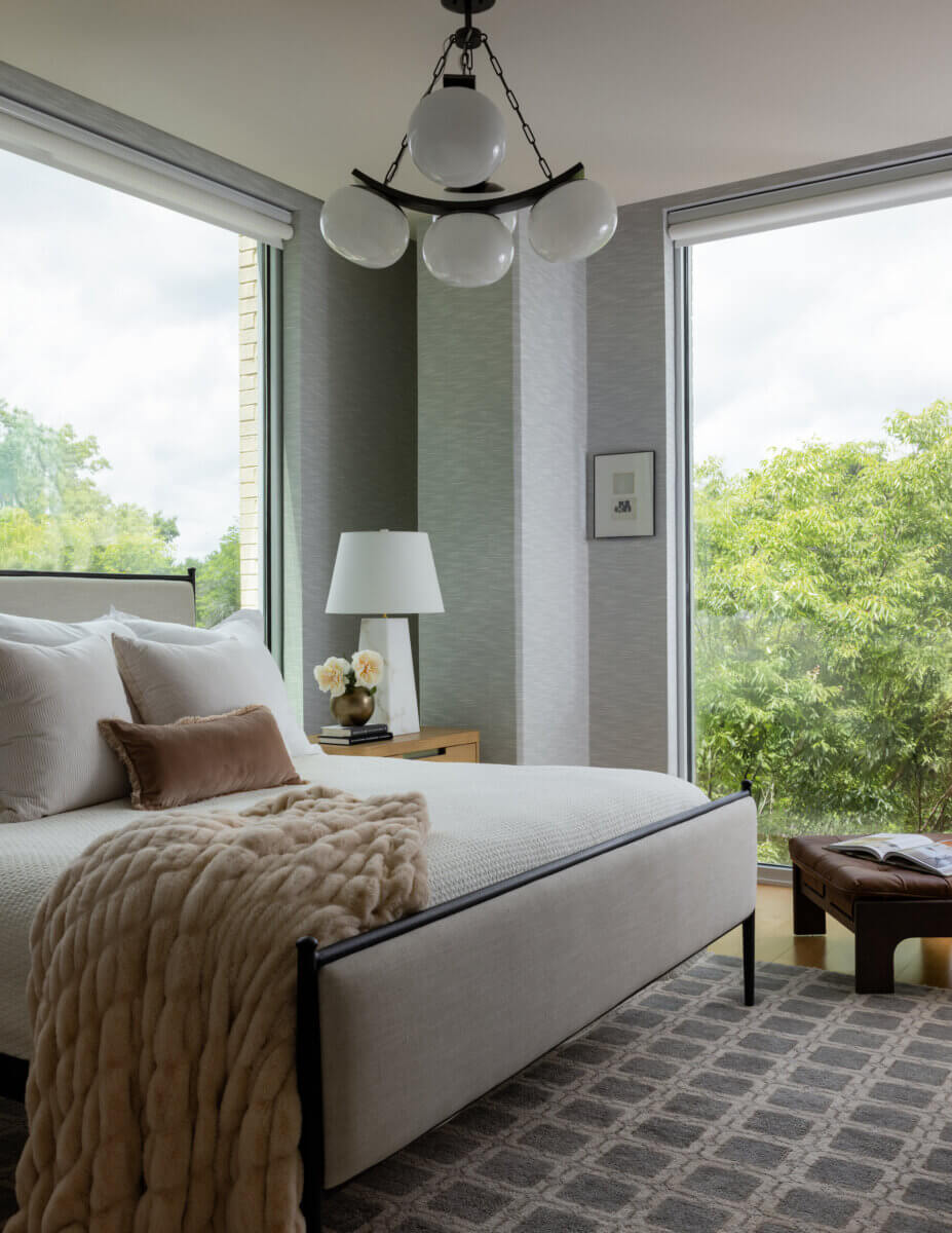
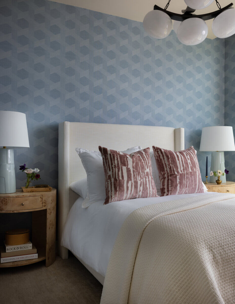
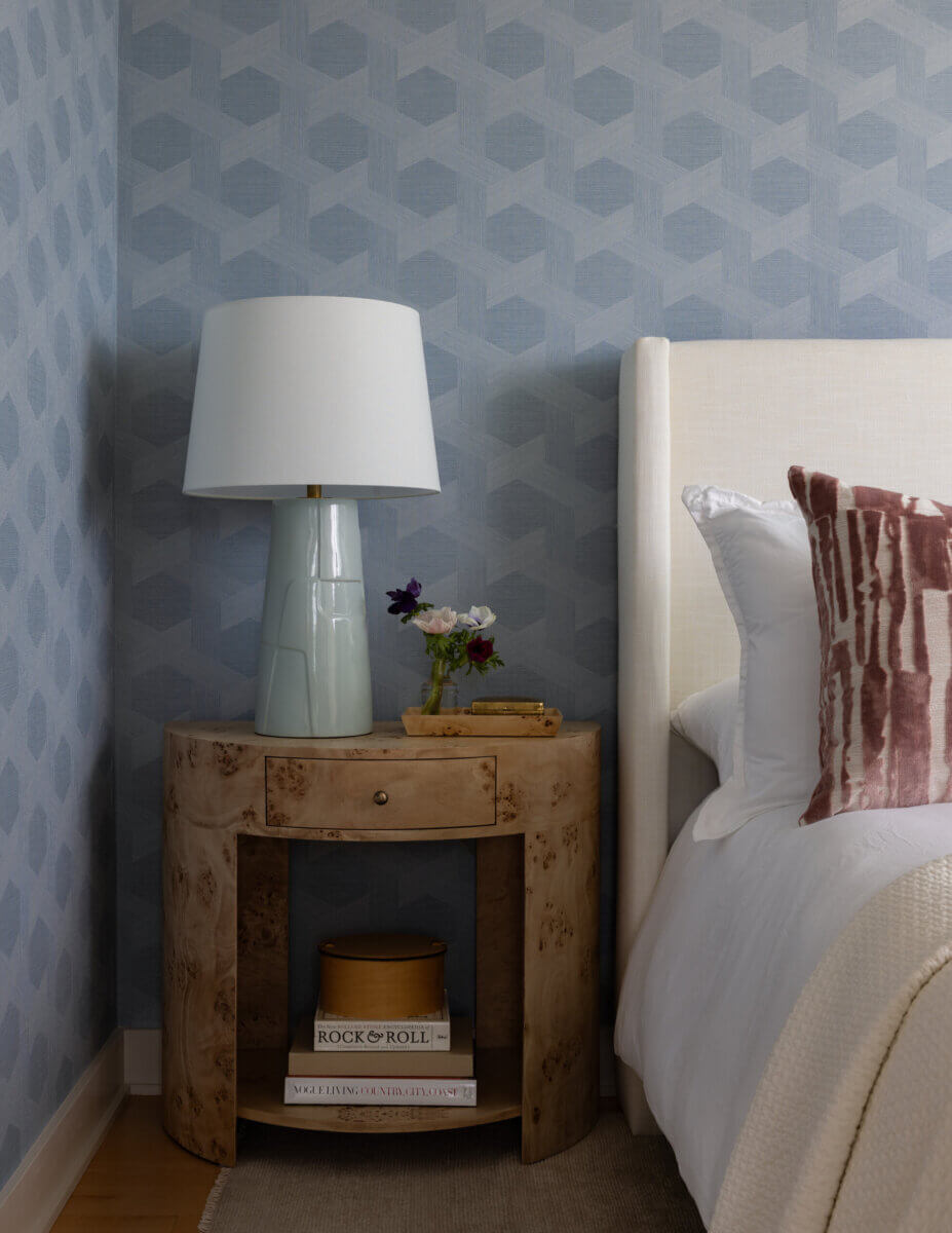
“The blue wallpaper helped give one of the bedrooms much more personality after it had previously felt very impersonal,” says Kristin. There’s a sense of cozy classic style and modern elements in this room, where a plush ivory upholstered bed features layers of comfortable textiles, and burl-wood nightstands and a contemporary chandelier add an unexpected touch.
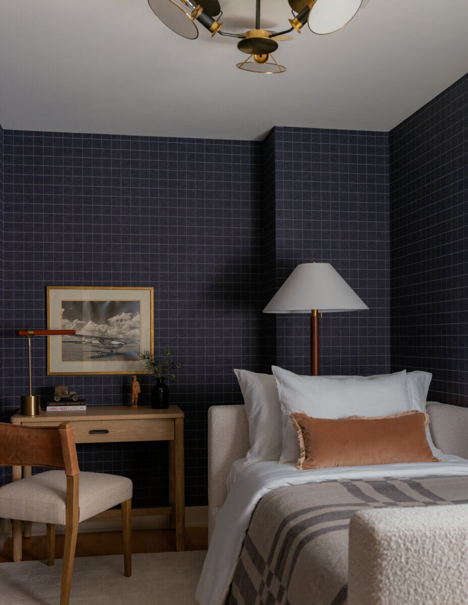
There are two official bedrooms in the condo, but the third space — a study-meets-guest room — has an academically inspired style that stands out while also fitting into the palette of blues and warm tones. “The navy wallpaper is Phillip Jeffries’ Savile Suiting Plaid and is used in the study/guest room, which also serves as a bedroom for Maya’s younger brother, Bodi, when he visits,” says Kristin. “The pattern has a suiting-inspired, fabric-like quality that adds warmth and texture to the room.”
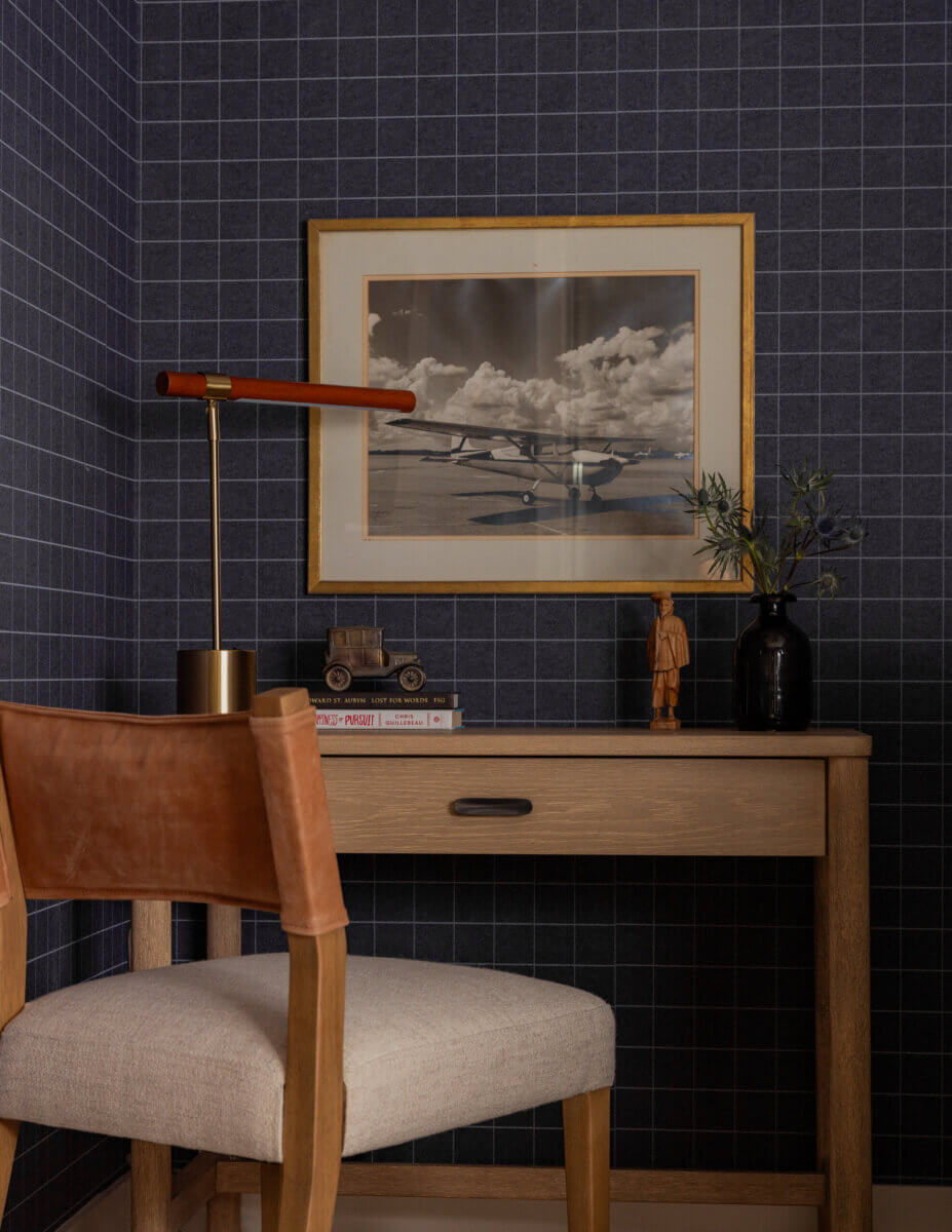
While using wallpaper throughout the home might seem like a bold move, it’s actually a strategic decision that offers more options for changing up the look in the future.
“Leaning on wallcoverings allowed some level of flexibility in the design down the road,” she says. “If the homeowners ever wanted to make a change in the style of the space, changing out the wallcoverings, but keeping the furniture as is, would be a relatively easy and impactful change.”
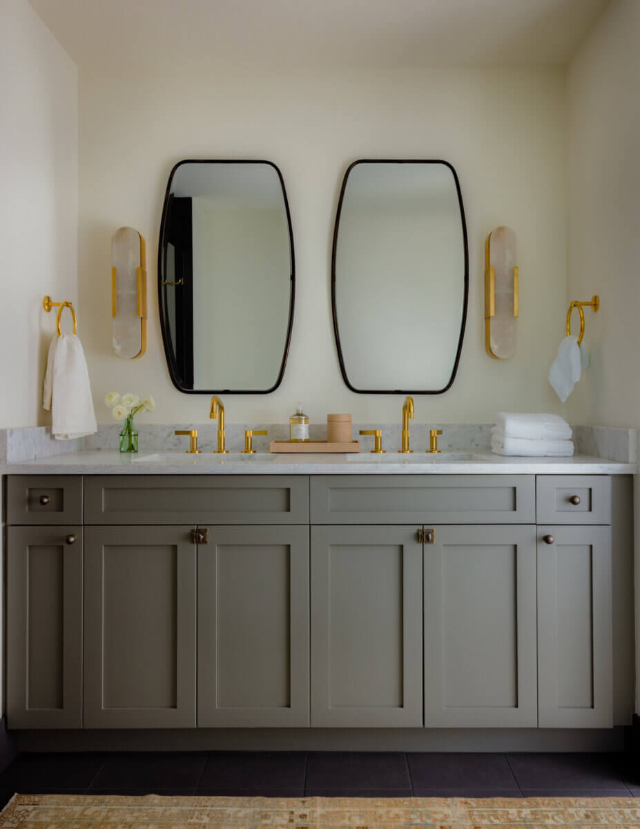
Designing for the moment, with the future in mind, was the ultimate goal of this small but transformative redesign. Kristin kept it simple, but intentional, for a look that nods to a theme without being campy. As she explains, “Since this isn’t a long-term residence, the design was all about balance.”
**********
For more home decor inspiration delivered right to your inbox — subscribe to StyleBlueprint!

Heather Bien
A Virginia native and professional writer of over 10 years, Heather is passionate about home decor, cooking and entertaining, travel, ballet, and coffee. You can find more of Heather's work in Southern Living, Martha Stewart, The Knot, Apartment Therapy, and Virginia Living.