Modern energy and rustic charm can occupy the same space, a point proven in this beautiful Eads, TN, home. In fact, the healthy competition of contrasting themes often creates a compatible design that yields a pleasingly bold setting. Today, we’re looking at the steps designer Selena McAdams took to achieve this look and swooning at the results!
Flip the switch.
This home is a modern adaptation of the rustic aesthetic. Formerly, John Sandoval’s home was overpowered by a mixture of numerous styles, so he welcomed the clarity offered by interior designer Selena McAdams, owner of Spruce, a Memphis boutique. Selena introduced a plan for relaxed, functional comfort. She then added energy to the composition by pairing traditional elements with eclectic furnishings, layering textures and patterns, and occasionally breaking the rules. In Selena’s words, it is important to “flip the switch” periodically whenever a room becomes too one-dimensional.
Welcome the ebb and flow of a room.
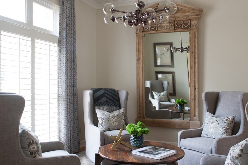
An advocate of the unexpected, Selena likes to insert conversational objects and furnishings in an interior space. It is often the tasteful choice, she adds, to let a strong design feature stand alone. For instance, not every adjacent room in this grouping needed a statement light fixture. “It’s OK to let one shine. It’s all about the ebb and flow of materials and textures breathing life into a room,” Selena says.
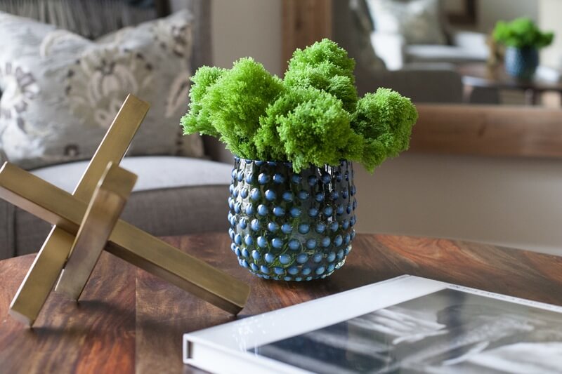
In the sitting room, note how a brave combination of a classic, ornate mirror with an assertive, modern light fixture represents the ebb and flow of this room. There are also understated gestural patterns layered into the space for subtle contrast, drawing the eye from piece to piece. One conversational element in this room is a ribbed silk rug by Stark, an additional dimension with its soft, reflective sheen, and the coffee table accessories represent an eclectic marriage of soft, hard, natural, modern and classic.
Break the rules.
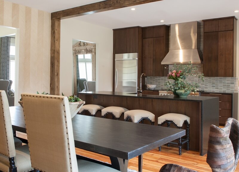
Major changes primarily happened downstairs in this 2014 renovation that wrapped up just in time for New Year’s. At the start, moving a large wall opened the main living area, which added a grand feel to the kitchen and dining room within existing square footage. The space was already there; it just needed to be reappointed.
The once-small dining room was transformed into a sitting room with high-back swivel chairs, and the living room is now a dining room that opens to the kitchen. This updated arrangement invites relaxed small and large gatherings, and the formal living room is not missed. “It’s all about thinking outside the box and making your square footage work for you,” Selena explains, “and the greatest thing about design is breaking the rules so that your space works for the way you live.”
Proper scale is nonnegotiable.
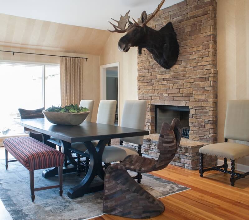
With a male as the primary owner, Selena enjoyed the opportunity and intermittent challenges of playing into a masculine style. “In our very first meeting,” Selena recalls, “he showed me a buffalo head in his office that was at least five feet tall and a picture of a moose head taller than me and said, ‘We are going to need to find a home for this.’ ” Selena responded by increasing the scale of the fireplace and overall dining room layout to accommodate the size of his prized item.
Proper scale is always one of Selena’s primary goals. As mentioned, the moose head’s size greatly influenced subsequent choices of proportion. Similarly, the large, ornate mirror that John already owned was inspiration for the scale and style of other furnishings in the sitting room. For example, even though the statement light fixture chosen for that room is, in contrast to the mirror, quite modern, the fixture does match the mirror in both size and grandeur. This was a decision Selena made to “flip the switch” in the sitting area. The reason it works: careful attention to scale.

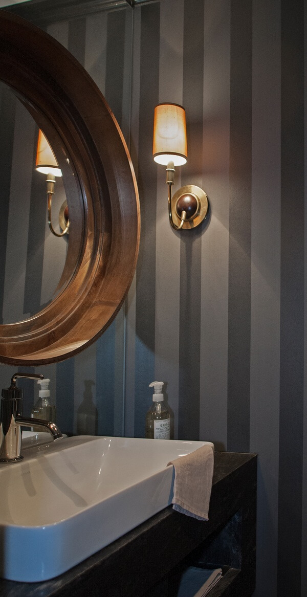
Where space is limited, there are ways to totally trick the eye into seeing a bigger area. In this home, for example, removing crown molding in the kitchen and dining room not only created a more contemporary feel, but also heightened the rooms by transferring emphasis away from the roof line. Other common design strategies to heighten a room include using taller drapery panels and higher cabinetry. And in this home’s powder room, a plate glass mirror was used in lieu of a backsplash to make that space feel larger.
Play with color, pattern and texture.
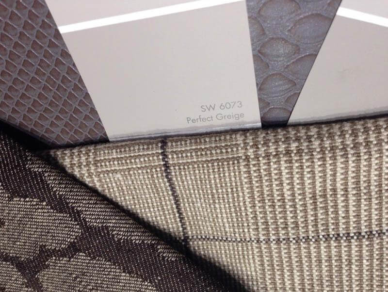
Influenced by John’s affinity for the rustic, this project called for a consistent use of warm tones. Within this palette a variety of patterns and textures add visual interest. In the main living areas, an abundant use of Chevron Texture wall covering by Schumacher is one of Selena’s favorite selections they made for the home. It provides a warm background hue with subtle, modern pattern and rustic texture … all in one design element. “I so enjoy the delicate balance between refined and rustic, and how the juxtaposition of those elements within the same space can create drama and interest, even if the color palette is subtle,” Selena says.

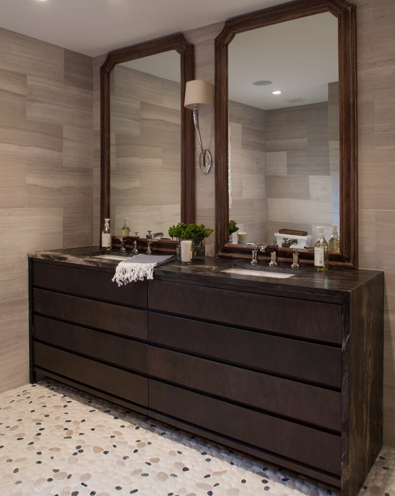
This playful use of color, texture and pattern is pervasive throughout the house, from leathered, black granite countertops in the kitchen, powder room and bath areas to pebbled stone flooring in the master bath.
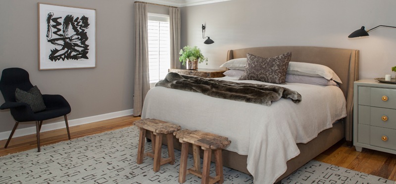
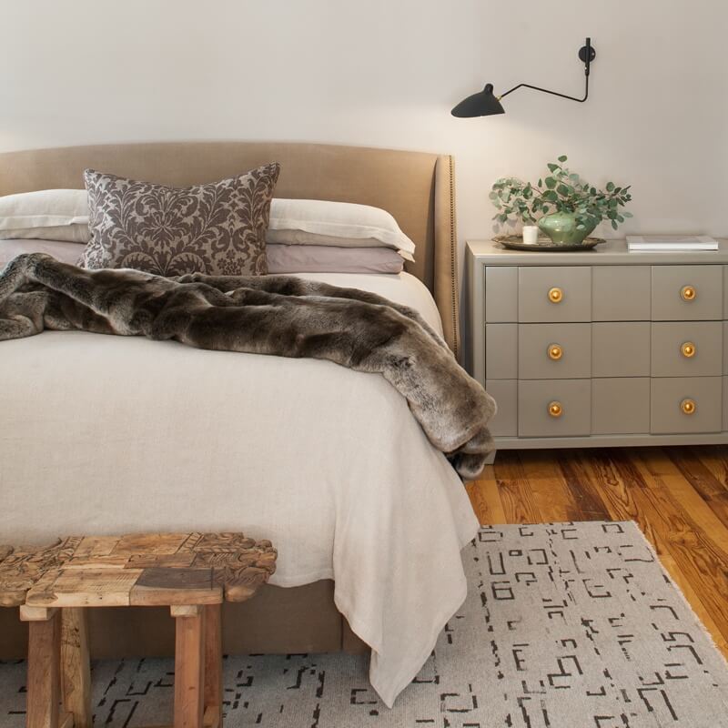

The ebb and flow of this modern rustic interior began with a reorganized floor plan and continued to completion with an emphasis on scale, visual movement and assertive design choices. Occasionally, Selena enjoyed bending the rules, and the result is a customized interior where form and function are compatible.

Resources
- Interior and spatial design, materials and furnishings: Spruce
- Meg Kerr at Spruce
- Contractor and custom cabinetry: Hunt Simonton of HS Carpentry
- Plumbing: Mark Wade of Wade Plumbing
- Countertops: Mark Childress of American Granite
- Appliances and fixtures: Ferguson
- Tile and natural stone: Natural Stone & Tile
- Carpeting and rugs: Kiser’s Floor Fashions
- Artwork: L Ross Gallery
- Photography: Julie Wage Ross
**********************


