
This Designer Wrote the Book on Creating Colorful Spaces — Literally!
Meet Susan Jamieson, the creative force behind Bridget Beari Designs. Through her new book "Bridget Beari Color Rules'" she’s on a mission to help clients stop fearing color and start living in a home that feels alive. Image: Gordon Gregory
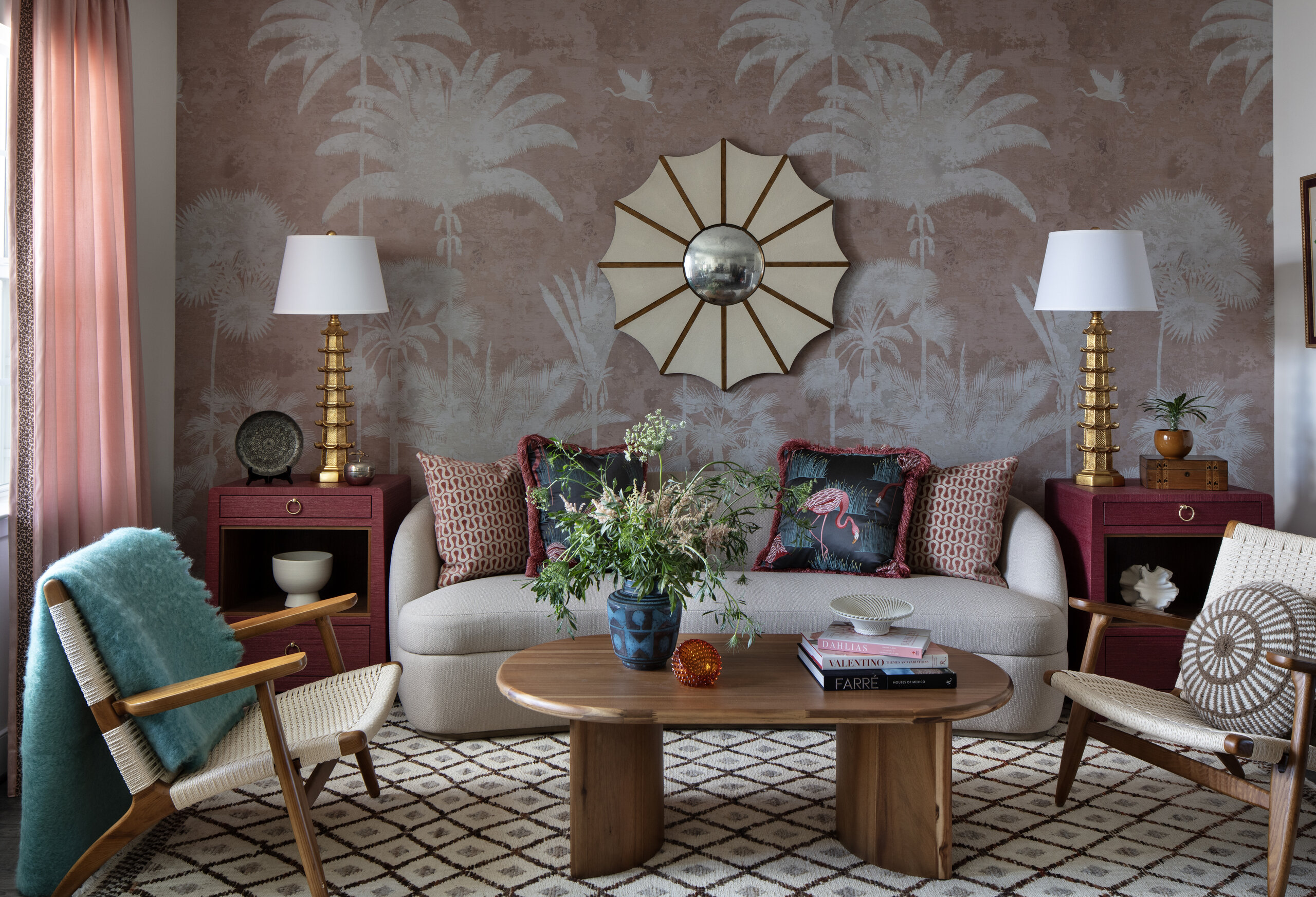
Whether she’s designing a jungle retreat in Mexico or curating her own line of paint and wallpaper, Bridget Beari Designs founder Susan Jamieson leads a colorful life. With a background in art history and an eye for the extraordinary, the Richmond, VA-based designer transforms spaces into vibrant, personal sanctuaries that reflect her clients’ lives. Her latest endeavor, “Bridget Beari Color Rules,” demystifies the world of color, encouraging homeowners to embrace hues that influence mood and tell their personal stories. We caught up with Susan to talk palettes, rescue animals, and the three things no home should be without.

You designed your own room at the age of 12. Was that when you knew this was your calling?
Actually, design wasn’t my first career ambition. I originally wanted to be a stockbroker. While I was in college, my mother was renovating a house and asked me to come home to attend meetings with the architect and designer because she was worried they might persuade her into choices she didn’t really want. During that process, I really connected with the designer we were working with. We developed a great rapport, and eventually I ended up working for her.
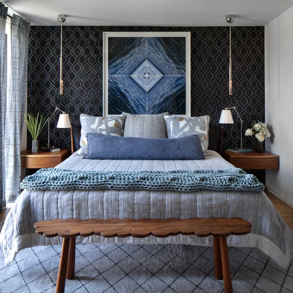
That experience opened my eyes to the design world and ultimately led me down this career path. So while designing my own room at 12 reflected an early interest in design, it wasn’t the defining moment that inspired my career. The real turning point came later through that renovation project and the opportunity to work alongside a designer.
You have a degree in art history and volunteer at a nonprofit gallery. How does art influence your work?
Art influences my design work every day. I love curating art collections for my clients, and my art history background helps me understand the quality, context, and significance of the pieces I select.
Volunteering with a nonprofit art gallery has connected me more deeply to the local art world and introduced me to artists and perspectives I might not otherwise encounter.

Studying art has trained my eye not only to recognize strong work but also to understand how artists use color, composition, and emotion. That directly informs my design choices, especially when selecting color palettes and creating rooms that feel layered, personal, and meaningful.
What inspired you to create a Bridget Beari line of paints and wallpapers?
The paint collection came first because I could never quite find the exact colors I wanted for my projects. I was constantly tweaking existing paint colors, adjusting them slightly to achieve the perfect shade. After doing that for years, it simply made sense to turn those tried-and-true colors into a collection of my own.
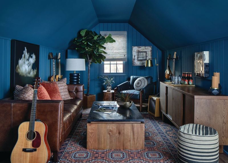
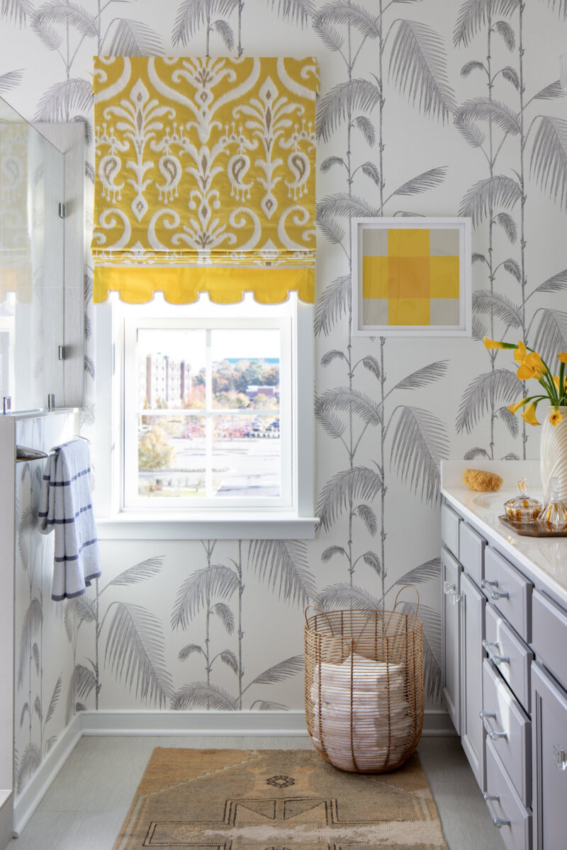
The wallpaper line was a natural extension of the paint collection. I wanted patterns that complemented the colors I was using, and once again, I often couldn’t find exactly what I was looking for in the marketplace. Creating my own wallpapers allowed me to design patterns that worked seamlessly with the paint colors and reflected the way I approach interiors.
You have seven rescue dogs and six cats. How have you woven your passion for animal advocacy into your brand?
Rescue has been a big part of my life for many years, and I strongly believe in supporting organizations that give animals a second chance. That’s why it was so important to me that the Bridget Beari brand reflect that commitment. Not only is the company named after two of my rescue dogs, but many of our custom paint and wallpaper colors are named after dogs as well. Giving back to animal rescues and shelters through those collections felt like a natural way to combine two things I care deeply about: design and animal advocacy.

What do you wish more people understood about color and how to incorporate it into their homes?
If everyone fully understood color, I might be out of a job! In all seriousness, color is one of the most personal and powerful tools we have in design, yet it’s also something many people find intimidating.
I wrote Bridget Beari Color Rules to help people better understand color and feel more confident using it in their homes. Color has the ability to influence mood, create atmosphere, and tell a story about who you are. It doesn’t have to be overwhelming. When used thoughtfully, color can bring warmth, personality, and joy to a space.

What I hope people take away from the book is that color isn’t something to fear. It’s something to embrace. Whether through a bold wall color, a favorite piece of art, or small accents throughout a room, color can enrich not only our homes but also our daily lives.
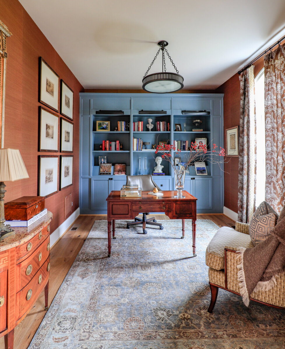
What has been your most challenging project to date?
One of the most challenging projects of my career was a home I designed in the jungle of Mexico. The project brought together a truly international team: Mayan workers who didn’t speak Spanish, an Italian contractor, and me, the American designer.
Beyond the language barriers, the home was designed to be completely eco-friendly and self-sustaining. It required a very different approach to design and construction than I had not experienced before.
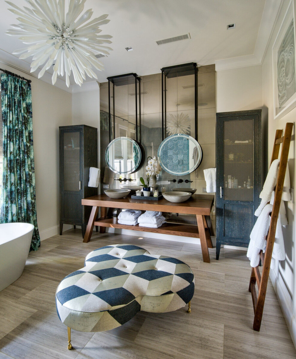
What made the project so rewarding was how much I learned. Immersing myself in a different culture, collaborating with people from diverse backgrounds, and designing within the constraints of a fully sustainable environment expanded my perspective tremendously. It challenged me to think differently, adapt constantly, and appreciate another avenue of design.
If you could decorate your home using only three colors, what would they be?
If I could choose only three colors for my home, they would all be whites, specifically from my own paint collection: Snowball, Goose Muffin, and Fat Cat. What I love about these colors is the subtle variation between them. Many people think white is just white, but there are incredible nuances that can completely change the feel of a space. Using different shades of white on the walls, trim, and ceiling creates depth, warmth, and sophistication without overwhelming the room.

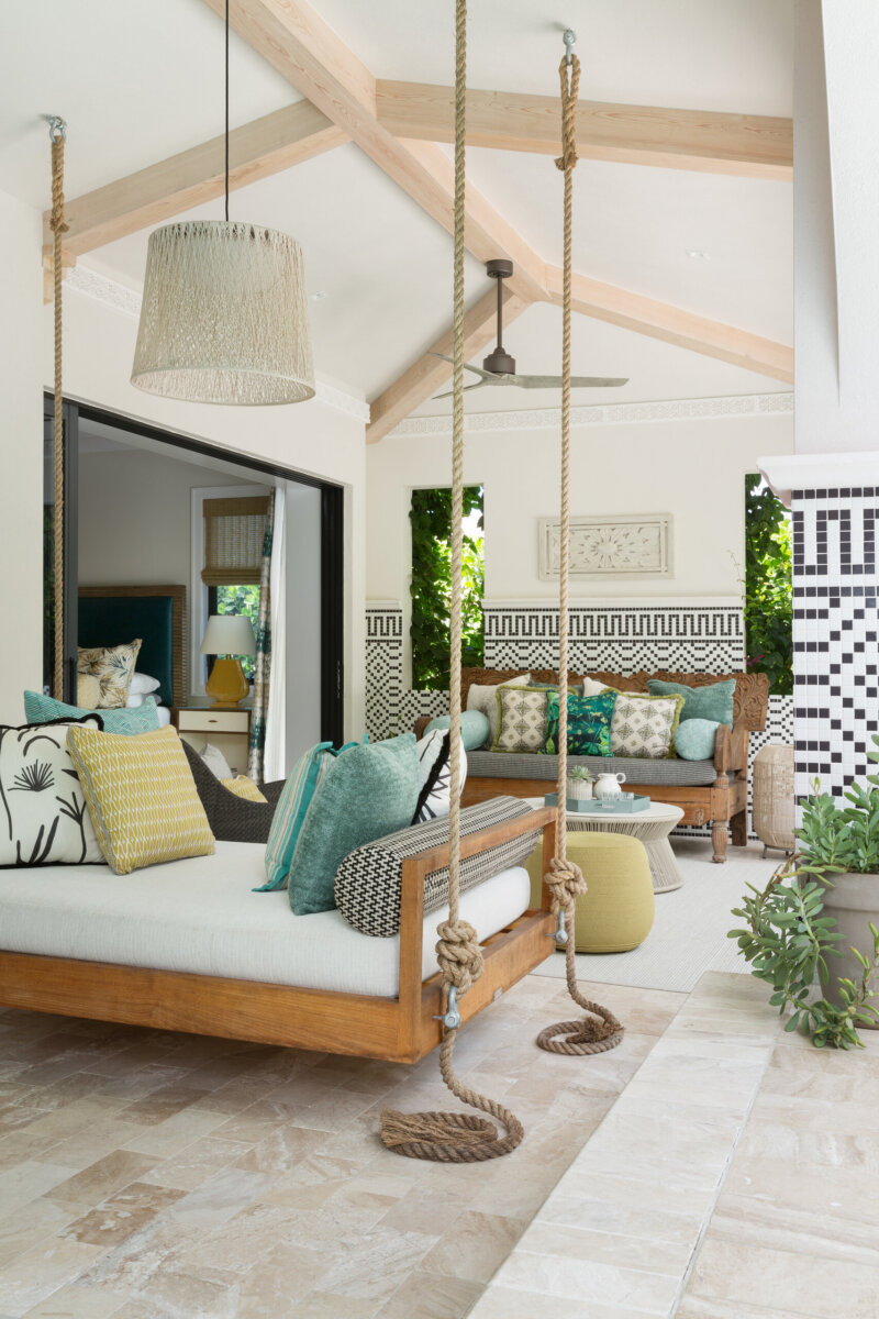
I also love playing with paint finishes. When you use a high-gloss finish on trim, ceilings, or millwork, those subtle white tones take on an entirely new dimension. The light reflects beautifully, creating a richness and shine that makes a space feel polished and elegant while still remaining timeless.
Where do you find inspiration?
Travel is definitely my greatest source of inspiration. I love exploring beautiful hotels, historic sites, and unique destinations around the world. Often it’s the smallest details that capture my attention, whether it’s a molding profile, a tile pattern, a door handle, or an architectural detail. I carry a sketchbook with me and frequently sketch those elements, many of which eventually find their way into a design project.
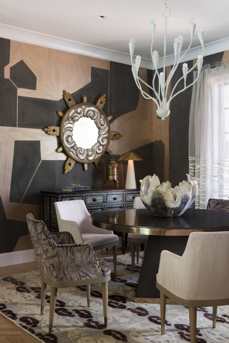
My second source of inspiration is Instagram. It’s an incredible platform for discovering talented designers, artists, architects, and makers from around the world. There are so many inspiring images and ideas that it’s easy to go down a rabbit hole and uncover something unexpected. Between travel and the constant flow of creativity online, I’m always collecting ideas and finding new ways to see design.
What one piece of advice can you give us to elevate our own homes?
My best advice is to always start with a plan. Too often, people buy pieces they love individually without thinking about how everything will work together in a space. Then they’re frustrated when the room doesn’t feel cohesive or function the way they envisioned. When you begin with a clear plan, every decision has a purpose, and the end result feels thoughtful, balanced, and complete.
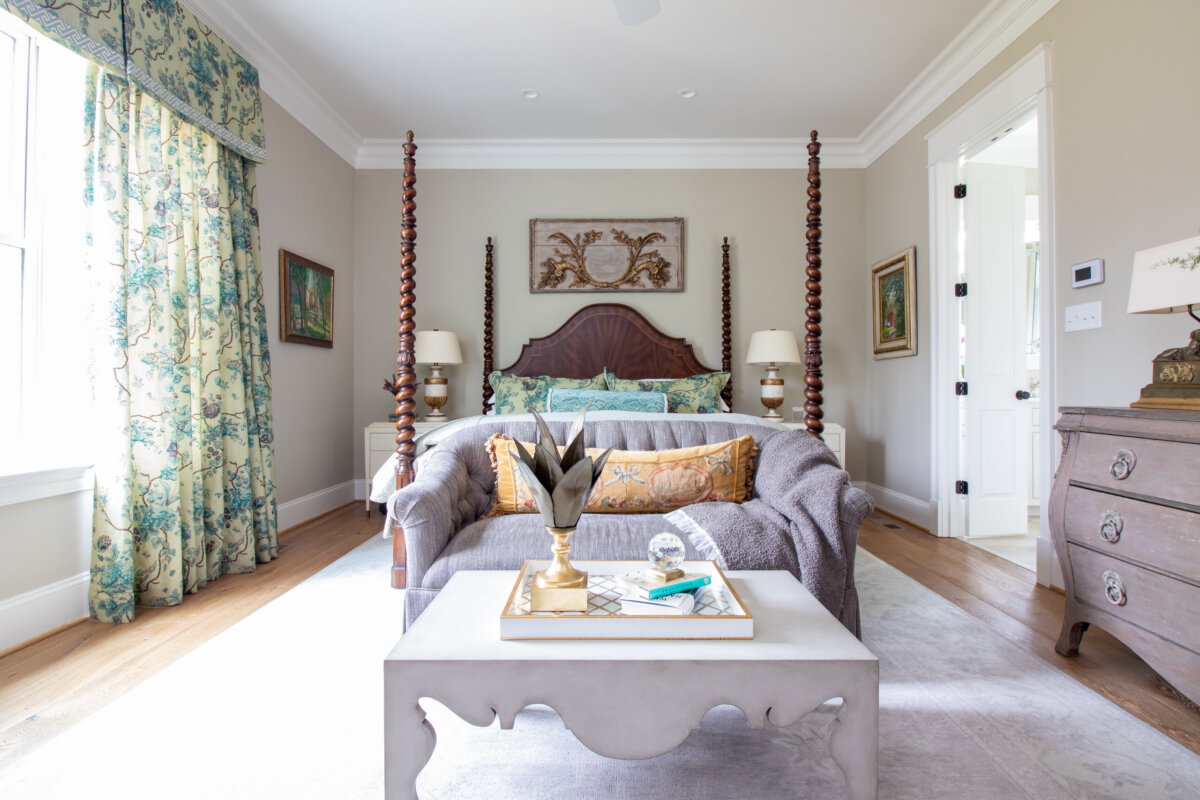
What three home decor items can you not live without?
If I had to choose just three home décor essentials, they would be good Frette towels, a Bridget Beari Mint & Eucalyptus candle, and quality light bulbs. The right lighting enhances color, creates warmth, and makes everything in a room look its best.
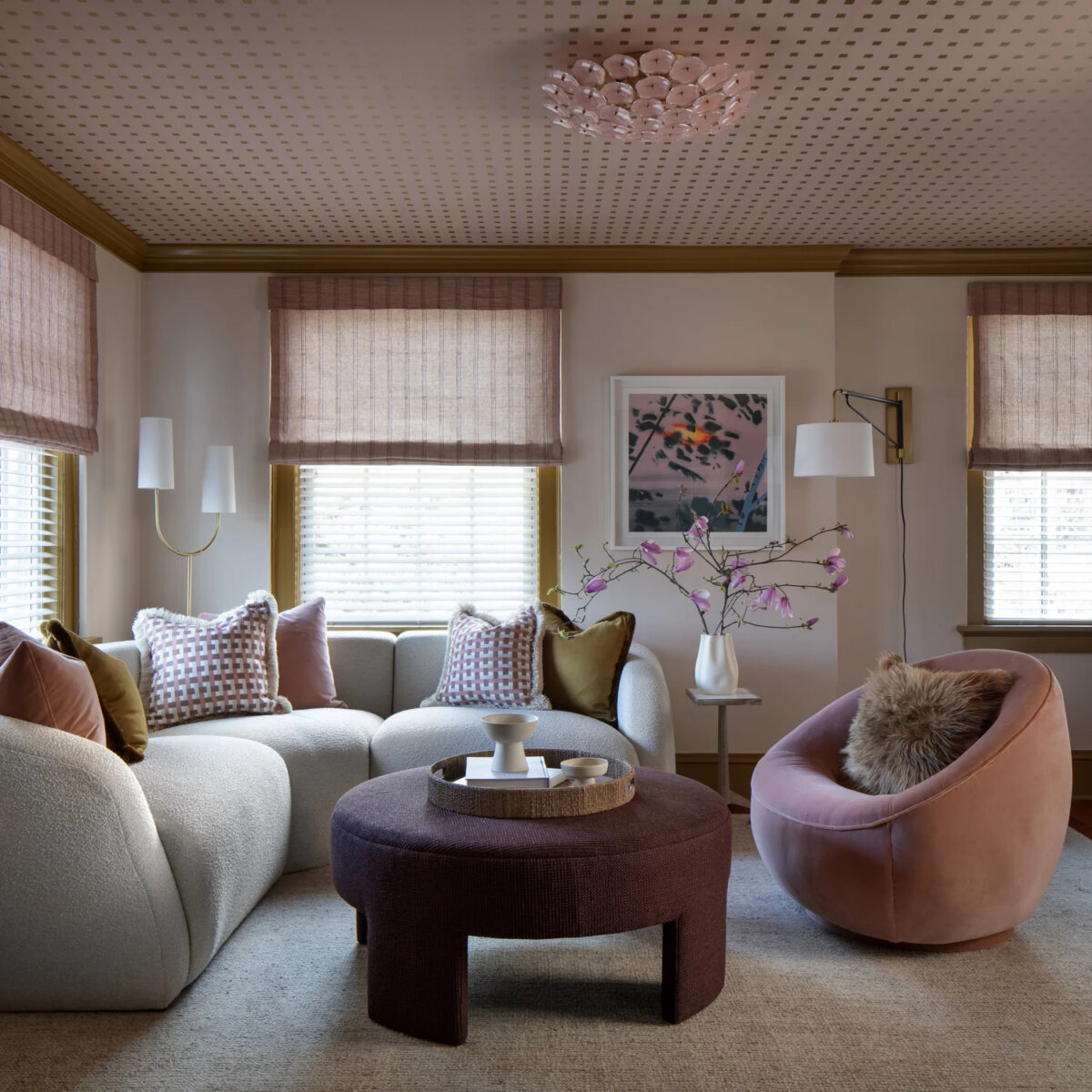
If you could describe yourself as a color, what would it be and why?
If I had to describe myself as a color, I would choose green. To me, green represents calmness, balance, and steadiness. It’s a color that feels grounded and connected to nature, yet it can also be vibrant and full of life.
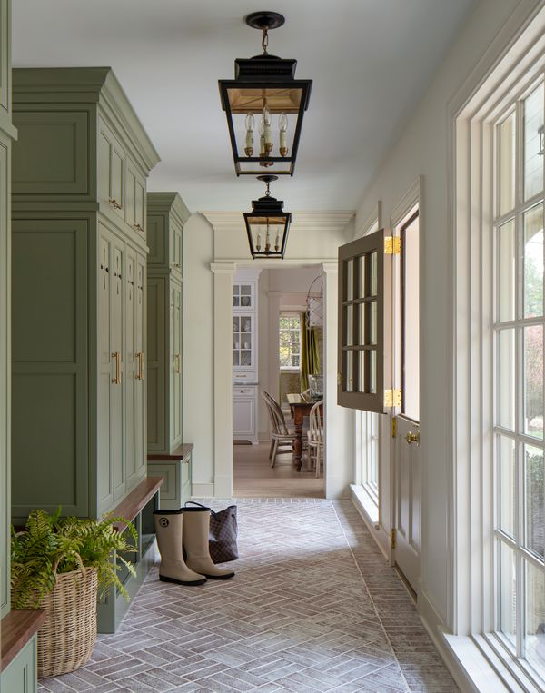
I think green has a quiet confidence about it. It doesn’t demand attention, but it always has a presence. Whether it’s a soft sage or a rich emerald, green creates a sense of comfort and stability, qualities that I value both in my life and in my work.
This article contains product affiliate links. We may receive a commission if you make a purchase after clicking on one of these links.
**********
For more interior design inspiration, check out our home features!

Bonny Osterhage
Bonny Osterhage is a professional journalist with more than 25 years of experience in both print and digital media. An avid fitness fanatic, when she isn't exploring the next trending topic, Bonny can be found cycling, running, and leading classes at SolidCore. Find more of her work at Mind Body Green, The List, Business Insider, and more.